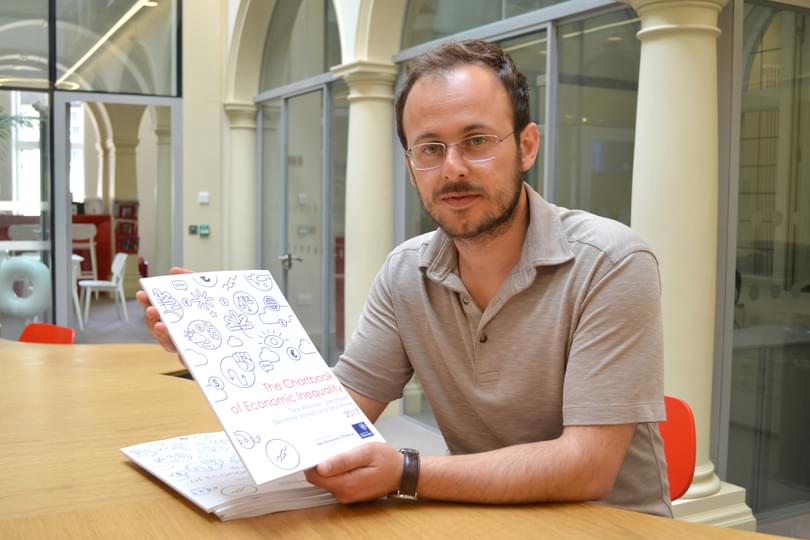
A new collection of long-range data on economic inequality provides detailed insights into how societies are developing around the world, but there is still much work to be done, one of its co-authors says.
The new edition of the Chartbook of Economic Inequality - a panoramic, long-range view of economic inequality across countries that make up 80 per cent of the world’s GDP – is now available as a free download and provides data for a variety of measures of inequality.
The report, co-authored by the late Professor Sir Tony Atkinson, eminent economist and a Senior Fellow at the Institute for New Economic Thinking at the Oxford Martin School, covers 25 countries, at varying stages of economic development, accounting for two thirds of the world’s population.
Described by co-author Dr Salvatore Morelli as “an innovative assembling of data that rests on years and years of research and collection of historical data”, the first version of the Chartbook was assembled in 2010 following a request from the International Labour Organisation (ILO) to Professor Atkinson to investigate the role of economic inequality in the run-up to economic and financial crises.
The project was carried out in collaboration with Dr Morelli, then Professor Atkinon's doctoral student at Oxford. Concerned at the lack of relevant information available, Professor Atkinson, who passed away on 1 January 2017, set out to compile as much data as he could, going back to the early 20th century where possible, in order to formulate an overarching empirical analysis of trends in economic inequality around the world.
Researchers are free to draw on the data for their own analysis as they please. “We want this to be a public good, and feel that we have a duty to make the data available in the best possible way,” said Dr Morelli, Visiting Fellow at INET Oxford. “The graphs cover a lot of areas but we have to be humble and say that there are still gaps in our knowledge, so this is also a call to researchers and institutions to help us fill those gaps. And this is something that we need now, not in 20 years’ time."
The Chartbook’s strength is to show inequality, over the long-run and in multiple dimensions, including how income is dispersed within a society (known as the GINI coefficient ), how labour earnings are distributed, the concentration of income at the top and bottom, and numbers of households living in poverty. In doing so, it builds on existing pioneering research projects and databases such as the World Wealth and Income Database, the Luxembourg Income Studies, and the OECD and EUROSTAT databank.
“Many analyses only look at the GINI coefficient, which has a lot of shortcomings,” said Dr Morelli. “It normally doesn’t capture the distribution and people may be missing out on the dynamics going on at the top. It’s a general problem for all countries in that there are intrinsic structural problems in sampling the income of very rich people.”
He continued: “Tony Atkinson was a big advocate of analysis of long-run economic data as a fundamental tool to understand the evolution of our own societies and economies. In doing so, he was one of the main interpreters of the classic political economy tradition of looking at how societies evolve by looking at how inequality evolves.
“One of my hopes is that, using this data it in combination with other relevant existing sources, people will uncover how different policies have affected income, wealth and earnings concentration over time.
"We take for granted that external forces drive how societies evolve. But it is clear, and it was Professor Atkinson’s conviction, that there are powers within societies – labour market institutions and education, welfare, and competition policies just to name few – that can change the pattern of economic inequality.”
The Chartbook's other co-authors are Dr Max Roser and Joe Hasell.